Calpendo
Redesigning a complex product site to improve clarity and structure
Role: Design
Duration:
8 Weeks
Context
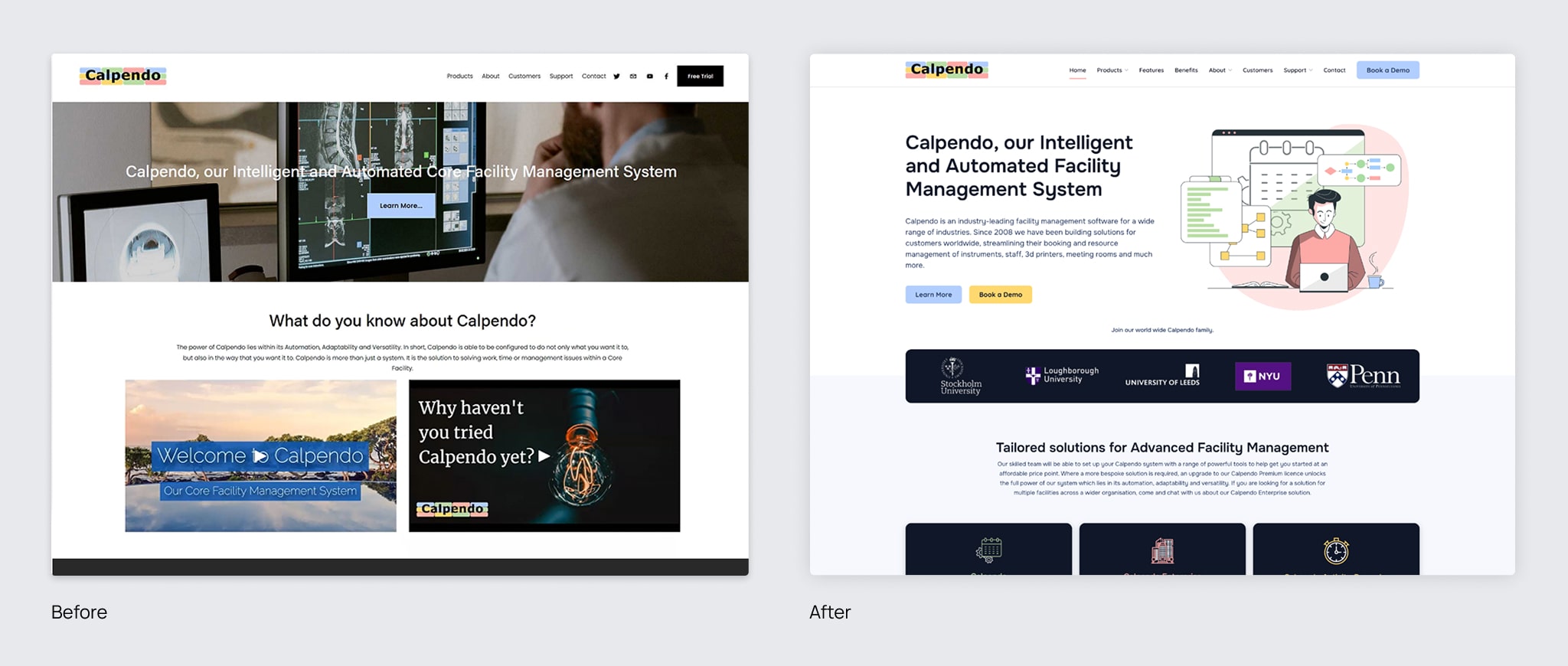
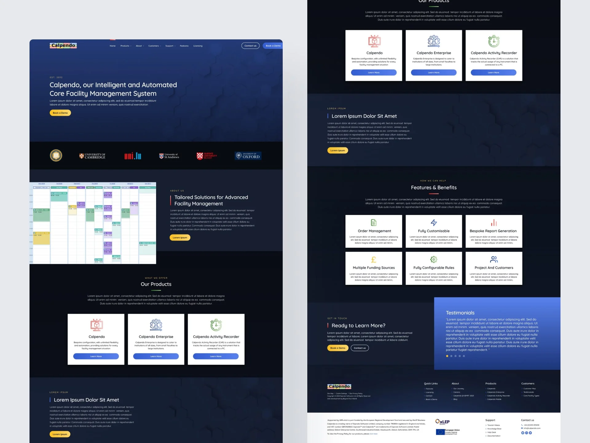
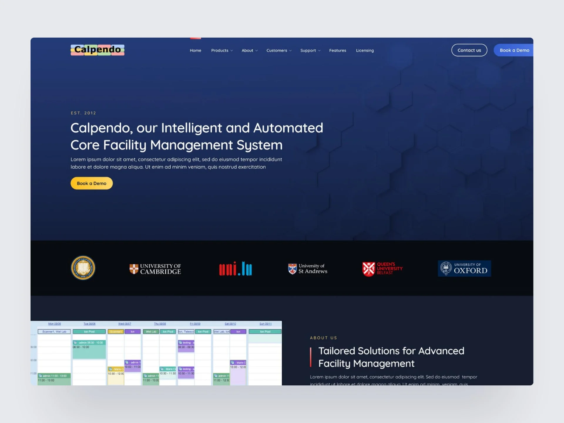
Calpendo is a facility management software used by researchers, lab managers, and admin teams in research and academic institutions. The original website made it difficult for users to understand what the software actually did. It was cluttered, too technical, and lacked a clear value proposition.
The challenge: Create a cleaner, more structured site that communicated the product's purpose quickly and clearly without overwhelming the user.
What Was the Problem?
The existing site had a few core issues:
- Messaging didn't explain the product clearly, especially for new users
- Content was dense, technical, and hard to scan
- The layout lacked structure, making the experience feel overwhelming
- No real product visuals or user proof, which made it harder to trust
The Solution
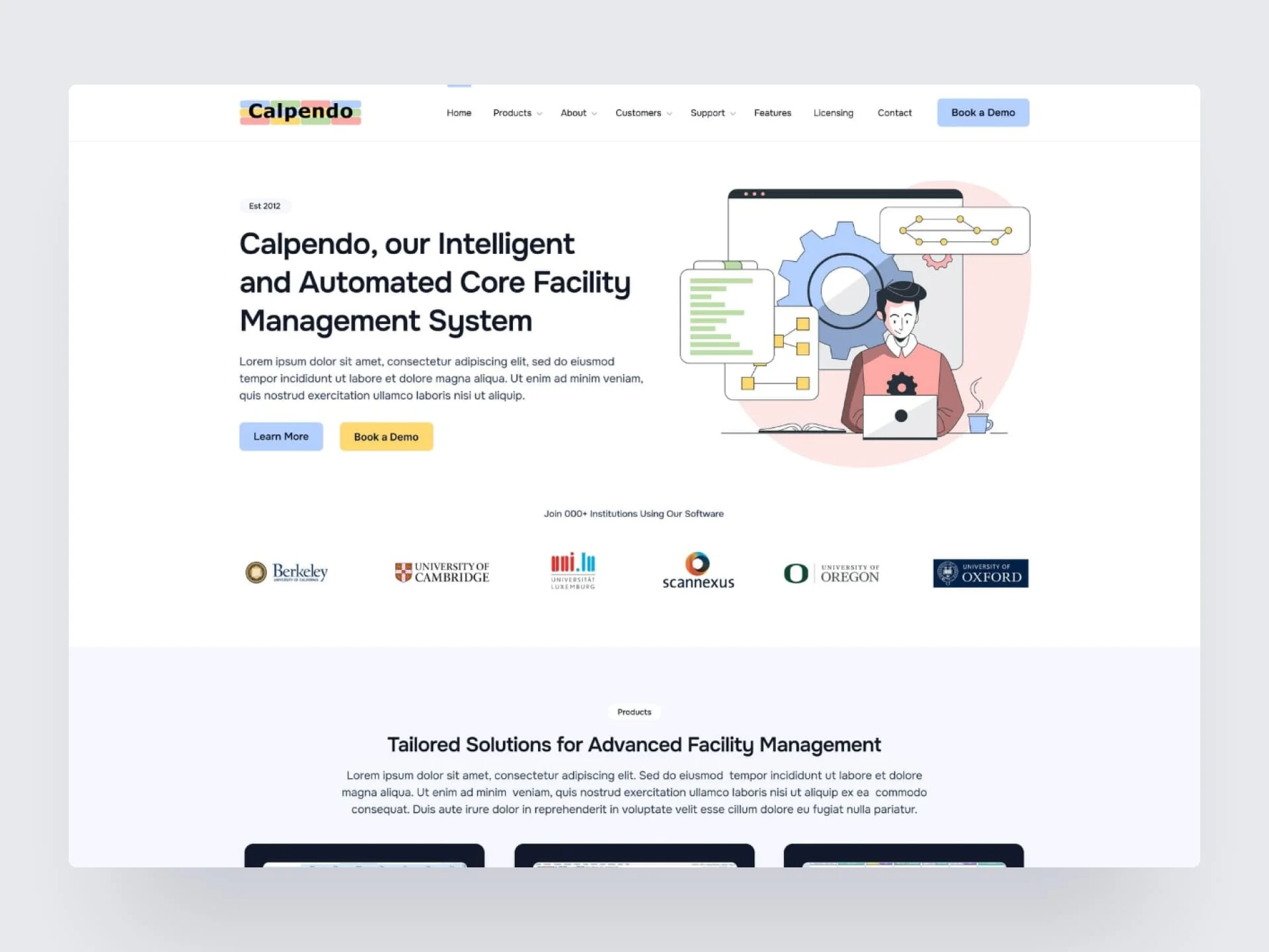
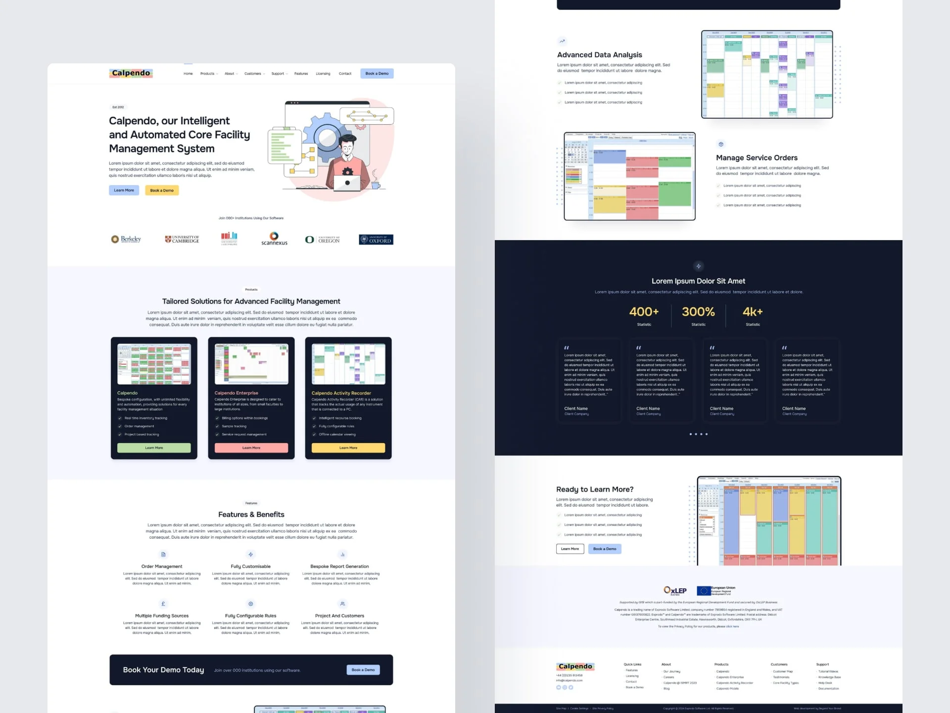
- Simplified the structure by reorganising content into clearer, more focused sections like what it is, how it works, and who it's for
- Clarified the messaging by rewriting and streamlining copy to focus on benefits, not just features
- Added visual support through product screenshots and testimonials to make the value more tangible
- Improved the layout with a clean, modular structure, stronger hierarchy, and more breathing room to help readability
Understanding the Users
Calpendo's audience includes lab managers and researchers who are usually busy, technically capable, but don't want to read through dense software pages to find out if something will work for them.
They needed a site that felt clear, direct, and confident. Something that explained the product quickly without overselling or getting lost in jargon.
Iterations and development
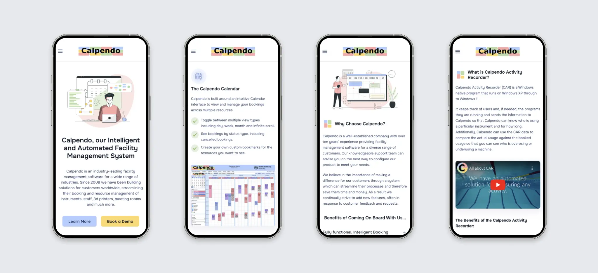
In the initial versions, I focused on using plenty of screenshots to help users quickly understand the software. The client was keen to use vector illustrations so we worked together and decided to combine both, featuring screenshots alongside illustrations. I also designed a darker version with a blue background, but we ultimately chose to move forward with a lighter design.
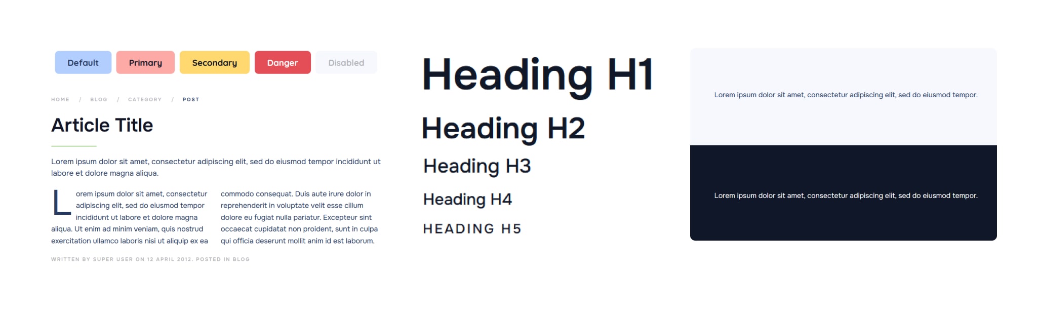
Design System
I developed a small, flexible design system which was designed to scale easily for future updates.
Outcome
The redesigned site is now easier to navigate and much clearer in its messaging. It gives users a better first impression of the product and sets a stronger foundation for future marketing.
If I Had More Time
I'd test the new structure with real users, especially first-time visitors, to see how well the new content flow holds up. I'd also explore building out more tailored content for specific sectors like hospitals or university labs.